Disassemble the B -end product and summarize the 3 principles of the design of the interface framework
Author:Everyone is a product manager Time:2022.08.02

B -end products always feel the same, basically charts, tables, details pages, or business processes. In fact, this is probably the case. After all, B -side products are mainly tool -type products or management systems, facing enterprise users, solve the actual needs of users, and rarely guide users to generate demand.
In this context, the performance, function, and user efficiency of the product became the first. If necessary, even a certain user experience will be prioritized to ensure product functions. Therefore, the B -end product system interface cannot be different for "looking novel", but also pays attention to the experience that users use.
This article mainly discusses the following content:
The three principles of the three design pattern interface framework design of the interface framework construct a new product from 0. First of all, the interface framework must be determined. The B -end interface framework is not complicated, mainly including the top information bar, the left navigation and content area. Through different combinations, the interface framework forms three design patterns.
1. Up and down structure
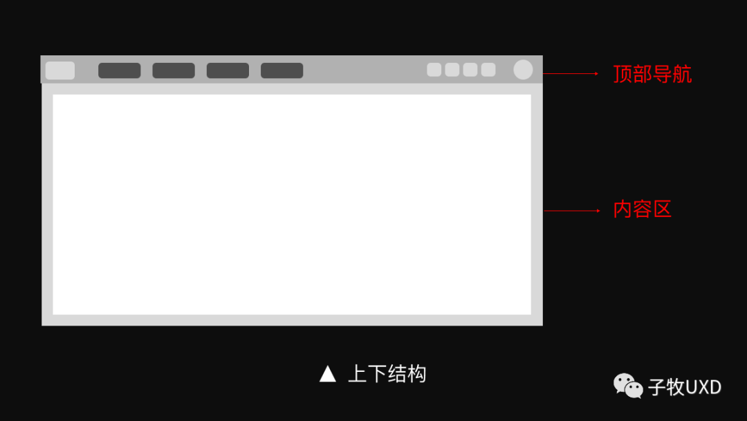
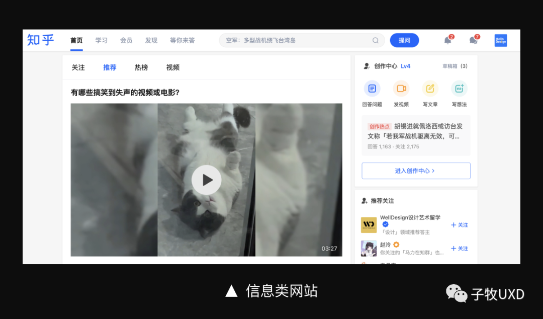
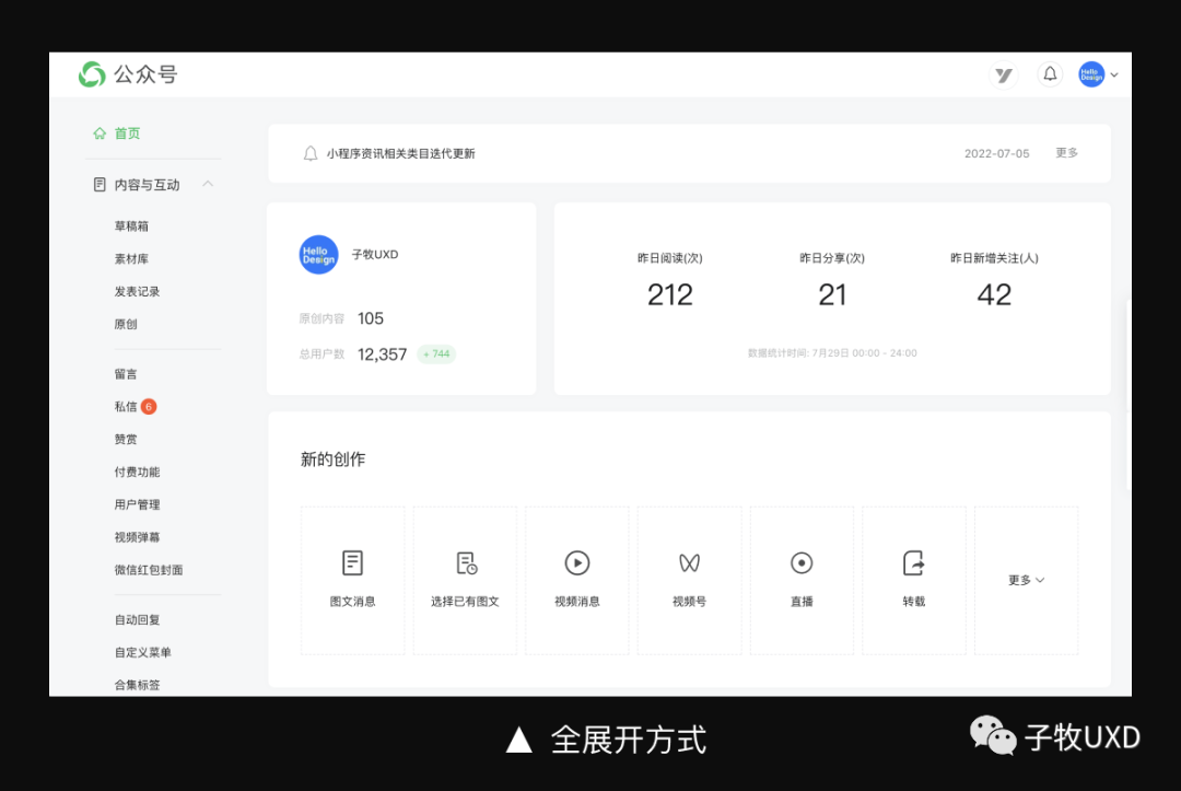
This page structure divides the page into two floors of "top navigation" and "content area". Common on some corporate official website and information website, more information display is more inclined. For example, information websites such as Alibaba Cloud, Sina, Zhihu and other information.
Generally, it includes system logo, function menu, auxiliary functions, personal centers, etc. The function menu is usually set according to the business sector, and the number of menu is limited, generally about 4-6.
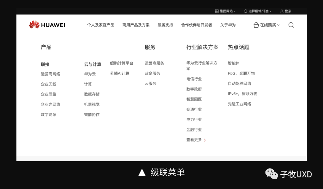
According to business needs, the function menu can also be expanded, allowing level 2 or even level 3 menus. It is convenient for users to understand the system function more deeper, while improving the operating efficiency of the user, and achieving the rapid direct and direct diverse of the deep pages.
I personally think that the advantage of top navigation is not to occupy the horizontal space of the page. Because the website of the information display class does not have high requirements on the horizontal space, in order to avoid the user's visual horizontal span excessively, some websites use the version of the heart -based design. The company's official website products use a response layout, so that the interface can adapt to different screen width.
The advantage of the top navigation is that the area is small, the division of the page is relatively weak, and it will not have much impact on the content. In addition, the horizontal discharge is more in line with the user's visual habits.
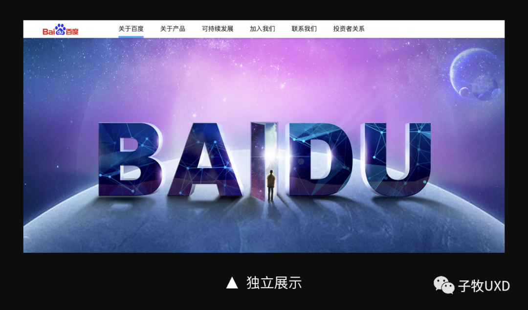
In the form of display, the top navigation is more flexible, and the menu can form an independent information space. For example, the top navigation of Baidu's official website forms a strong contrast with Banner, and the content is clearly visible.
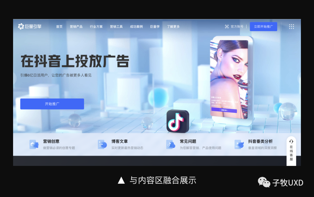
Top navigation can also be integrated with page content to reduce interference with content. For example, in the official website of the huge engine, the top navigation is mixed with the banner information to emphasize the transmission of content information.
In terms of interactive operations, when the page is scrolled down, the top navigation can be automatically hidden, thereby providing a larger visual area for the content; the page is automatically displayed when the page is rolled upward, which is convenient for users to quickly switch to other menus.
Second, left and right structure
For simple or complex business systems, the number of top navigation will face too much or too much problem, so the left and right structural layout will occur.

Facing simple business systems, the form of the left navigation will not generate a large number of pages blank. For example, the Baidu network disk web version, the Tembition is the interface framework used, simplify the first -level menu, displayed with the secondary menu, and the visual correlation is more closely.

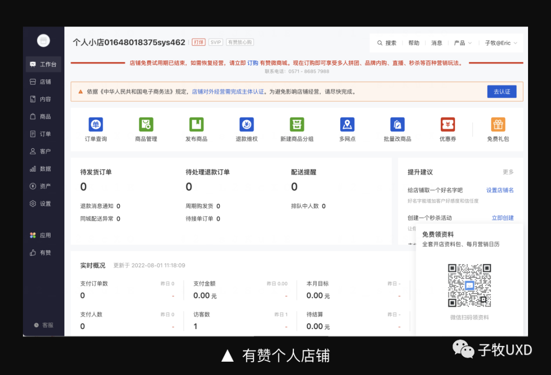
In the face of complex business systems, the left navigation can carry more menu volume, and the tree structure cooperates with the launch panel function, which has good ductility. For example, the navigation on the left side of Youzan's personal store carries 10+ business functions.
However, the defects of the left navigation are also obvious, mainly in the following aspects:
Large size and space. In order to reduce the information space of the content area as much as possible, the "collection" function is usually increased; there are many restrictions. In order to control the width of the navigation, the length of the menu name needs to be restricted to avoid the situation where it cannot be fully displayed; there will also be requirements for the system logo and name, which is not suitable for a system with a long name; the operation efficiency is not high. In the menu item that is closed by default, it is necessary to expand to operate; if the information level is deeper, the method of opening up step by step is not convenient for users to operate, so it also needs to be restricted to the level of information; in addition Functions, especially for newcomers, are not friendly, you need to click one by one to understand the system function. Therefore, when designing, you need to optimize design for the above problems. The following is a solution provided by some products:
(1) Single -layer information+grade joint information
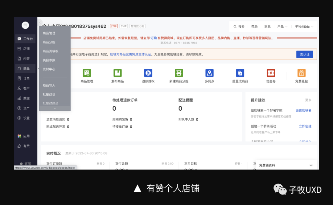
Youzan's navigation on the left side of the product follows the way of interacting on top navigation. There is no way to put away the way, but in the form of a class menu, it can be displayed by hovering to facilitate users to switch quickly.
(2) Default default
The menu function is fully expanded by default, reducing user operations. In the WeChat public account, Alibaba Cloud, Zhihu Creative Center and other platforms, the left side navigation is default. Users do not need to start step by step, so that users can quickly switch the menu. During the subsequent use process, the user can manually put away the unusual functions according to the needs of their own needs.
(3) Double column layout
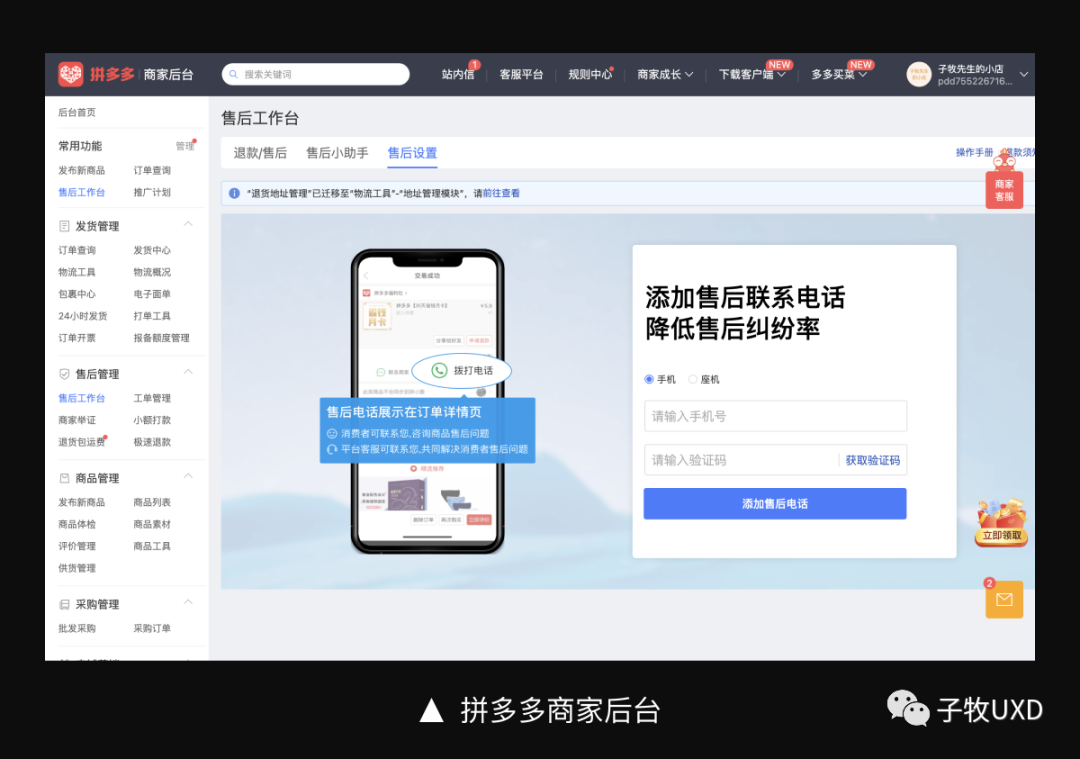
For the systems with complicated functional systems, the default -default method will cause the navigation area to be too long, and the user is inconvenient to check. Therefore, the information density of the menu is needed to reduce the overall length of navigation. For example, the background of Pinduoduo merchants adopts the form of double -column layout. Of course, in this scenario, the left navigation width will be increased and the space of the content area will be crowded.
(4) View all
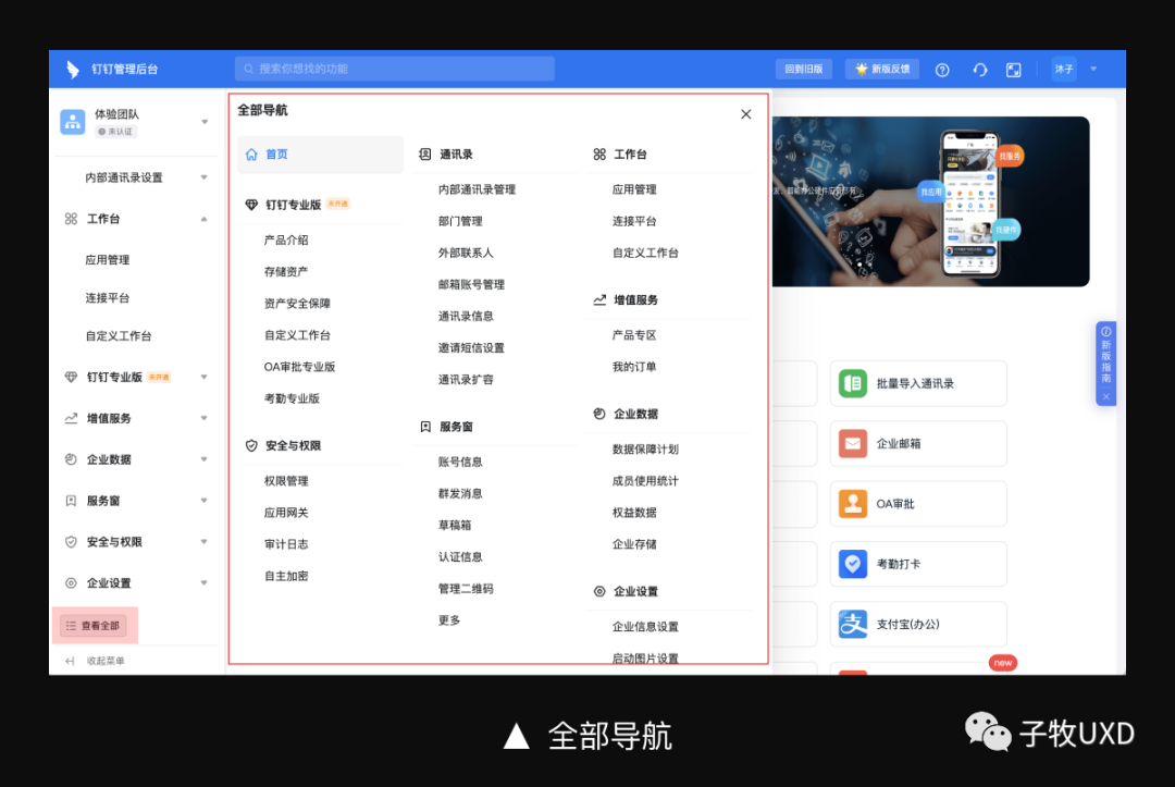
In the portal website, there are many information classification, and ordinary users usually only use high -frequency information. In order to allow users to enjoy all the information doors of the website, the website also provides the "website navigation" function. In B -end products, you also need to consider how to let users understand the entire function list of the platform. For example, the nail management background adds the "viewing all" function at the bottom of the navigation on the left. After the expansion, the user can see all the function menu.

In terms of formal sense, the layout of the left and right structures will compress the system logo and names. I personally think that the overall style is not as official as the upper and lower structure, and insufficient expression of the brand image. Therefore, this structure is mainly used for some tool products or lightweight systems, and there are fewer projects on large business platforms or G -end projects.
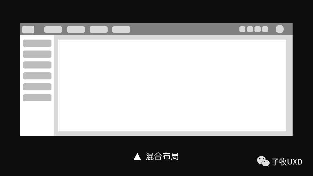
Through the above cases, we can see that B -side products are basically constructed in the "mixed layout" mode.
3. Mixed layout
In the B -end product, the mixed layout has both the top area that runs through, can carry the navigation menu and product framework information, but also increase the left navigation in the content area, enhance the carrier capacity of the navigation information, and better meet the business function needs.
For example, in huge amounts of vertical and horizontal products, the combination of top navigation and left navigation is used to divide the product into several independent business units. Users can choose the corresponding features according to their own work goals. At the same time, the information bearing capacity and hierarchy of the left navigation are also reduced to facilitate user operations.
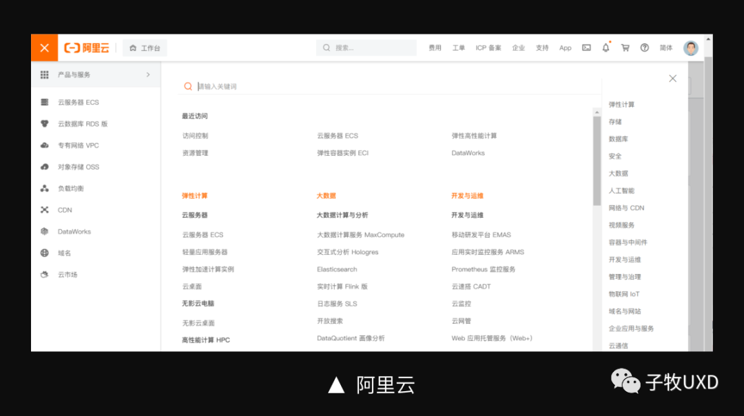
If the system function is extremely complicated, the traditional "top navigation+left navigation" model can no longer meet product needs. For example, cloud products are large business platforms, including dozens of business functions. Therefore, the central model of "product and service" is built to concentrate the full business functions in a full quantity, which is convenient for users to browse and view. To a certain extent, users have also increased the desire to explore more functions.

In this model, each independent product or service forms a subsystem space, using a unified mixed layout method to make the original complex business system simple.
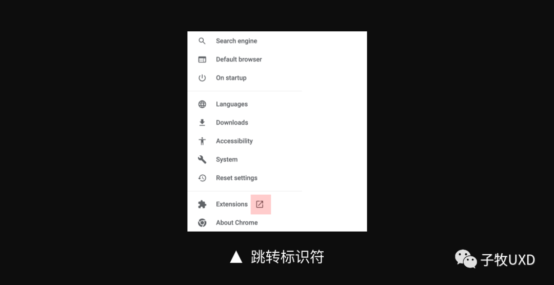
There is also a small detail.

The psychological suggestion that the navigation menu brings to the user is "switching" to control the information area of the right content area. When we embed other system functions in the left navigation, if it is a "jump" operation method, we need to increase the indicator icon, as shown in the figure below.
Fourth, summary
The above is the content of the B -end product interface framework. We can get 3 design principles:
Conquering the positioning and business needs of the product. The product interface framework should be able to carry the entire business system of the product and have sufficient ductility. It is necessary to consider the future upgrade and development of the product. Ensure the operating efficiency of users. The form of navigation will affect the operating efficiency of the user. Therefore, it is necessary to be cautious in the level setting to avoid too deep levels that affect the user's operating efficiency. At present, the mainstream left side navigation is mainly two layers. Global perspective. Navigation is the first channel for users to understand product functions. When designing, it is necessary to consider the feelings of users' use, but also to allow users to understand the overall situation of the system more intuitively. #Columnist#
Mr. Zimu. Public account: Zimu UXD (HelloDesign), everyone is a product manager columnist. Product experience designer. 8 years of experience in the Internet industry, who is good at experienced design thinking, design methodology, interactive design research.
The original published in this article is a product manager, and reprinting is prohibited without permission.
The question map is from UNSPLASH, based on the CC0 protocol.
- END -
Butterfly Effect | Submitted works

*由 The picture of this article was uploaded by Mr. who was afraid of trouble, and...
The "2022 E -commerce anchor Contest" finals, Pingtan debuted!
On July 3, the 2022 E -commerce anchor Contest finals officially launched in Shish...