Exclusive | How to compare two or more distribution forms (attached links)
Author:Data School Thu Time:2022.08.17

not
Author: Matteo Courthoud
Translation: Chen Chao
School pair: Zhao Ruxuan
This article is about 7700 words, it is recommended to read for 15 minutes
This article introduces two or more data distribution forms from the perspective of visual graphics and statistical inspection methods.
Comparison of comprehensive distribution forms from visualization to statistical testing:
The picture comes from the author
Comparing the experience distribution of the same variable between different groups is a common problem in data science. Especially in causal inference, we often encounter the above problems when we need to evaluate random quality.
We want to evaluate the effects of a policy (or user experience function, advertising, drugs, ...). The gold standards in the cause and effect inference are random control tests, also called A/B tests. Under actual situation, we will choose a sample for research, randomly divided into control groups and experimental groups, and compare the differences between the two groups. Randomization can ensure that the only difference between the two groups is whether it is treated, and on average, so that we can attribute differences in the treatment effect.
The problem is that although randomization is carried out, the two groups will not be exactly the same. Sometimes they are not even "similar." For example, we may have more men or older people in a group, and so on (we usually call these characteristic collaborative variables or control variables). When this happens, we can no longer determine the difference between the result is only caused by the effect of treatment, nor can it be completely attributed to the unbalanced collaborative variable. Therefore, a very important step after randomization is to check whether all observation variables are balanced between groups and whether there is no systemic difference. Another option is layered sampling, and the amount can ensure that specific collaborative variables are balanced in advance.
In this article, we will compare the two groups (or multiple groups) in different ways and evaluate the magnitude and significant level of differences between them. Visualization and statistical perspectives are usually rigorous and intuitive weighing: From the figure, we can quickly evaluate and explore differences, but it is difficult to distinguish whether these differences are systematiac or only caused by noise.
example
Suppose we need to randomly divide a group of people to the processing group and control group. We need to make the two groups similar to as much as possible in order to attribute the differences between groups to the treatment effect. We also need to divide the treatment group into several sub -groups to test the impact of different treatment (for example, subtle changes in the same drug).
For this example, we have simulated 1,000 data sets, and I introduced the data generation process from src.dgp dgp_rnd_assignignment (), and introduced some drawing functions and libraries from src.utils to observe a series of features. Essence
From src.utils Import * From src.dgp Import dgp_rnd_assignment dgp_rnd_assignignment () df.head ()
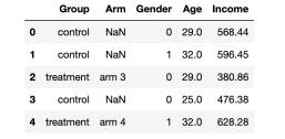
Data snapshot, the picture comes from the author
We have 1,000 test information, which can observe gender, age and weekly income. Each subject was assigned to the processing group or control group, and the trial of the processing group was tested into four different treatments.
Two groups-pictures
Let us start from the simplest situation: compare the income distribution of the processing group and the control group. First use the visual method to explore, and then use the statistical method. The advantages of visualization methods are intuitive, and the advantages of statistical methods lies in rigor.
For most visualization, I will use the SearBorn library in Python.
Box diagram
The first visualization method is the box diagram. The box diagram is a good extension between statistical summary and data visualization. The center of the box represents the median number, while the upper and lower boundary characterize the first and 3 % levels. The first data point of 1.5 times the quadriometric (Q3-Q1) is extended to more than a quarter of the box (Q3-Q1). The points that fall outside the beard are drawn separately, and they are usually regarded as abnormal values.
Therefore, the box diagram provides statistical summary (box and beard) and intuitive data visualization (abnormal value).
SNS.BOXPLOT (data = df, x = 'group', y = 'income'); PLT.TITLE ("Boxplot");
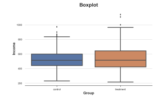
The income distribution of the combination control group, the picture comes from the author
It seems that the income distribution of the processing group is more decentralized: the orange box is larger and the body coverage is wider. However, the problem of the box diagram is that it hides the form of the data, just tells us statistics without showing us the real data distribution.
Square diagram
The histogram is the most intuitive way to display the distribution. It divides the data into a group of the same width and draws the number of observations per group.
Sns.histPlot (data = df, x = 'income', hue = 'group', bins = 50); PLT.TITLE ("Histogram"); The income distribution of the processing group and the control group The picture comes from the author
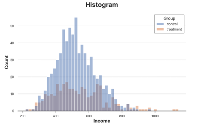
There are also many problems in this figure:
Because the number of observations between the two sets of two sets of observations is different, the two histograms are not comparable.
The number of groups is arbitrary.
We can solve the first method through the STAT option, draw the density instead of counting, and set the Common_norm option to false to normalize each histogram, respectively.
Sns.histPlot (data = df, x = 'income', hue = 'group', bins = 50, stat = 'density', commit_norm = false); Code>
The distribution of the processing group and the control group, the picture comes from the author
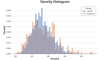
Now the two sets of histograms can be compared!
However, an important issue still exists: the size of the group is arbitrary. In extreme cases, if we tie less data together, we will finally get each group to at most observation data. If we bind more data together, we may eventually get a group. In two cases, if we exaggerate, the figure will lose the amount of information. This is the classic deviation-mutant exchanges.
Nuclear density chart
One possible solution is to use nuclear density functions to use nuclear density estimates (KDE) to use continuous functions to approach the histogram.
Sns.kDeplot (x = 'Income', Data = DF, Hue = 'Group', Common_norm = False); PLT.TITLE ("Kernel Density Function");
The income distribution of the processing group and the control group, the picture comes from the author

It can be seen from the figure that the estimated nuclear density of the income of the processing group seems to have "fatter tails" (higher variance), but the average value of the group is more similar.
The problem of nuclear density estimation is a black box. It may cover the relevant characteristics of data.
Cumulative distribution map
A more transparent representation of the two distributions is to accumulate distribution functions. At each point (income) of the X -axis, we draw a percentage of equal or lower data points. The advantage of accumulating distribution functions is:
We don't need to make any arbitrary decisions (for example, the number of groups)
We don't need to do any approximation (for example: KDE), but we can represent all the data points
Sns.histPlot (x = 'Income', Data = DF, Hue = 'Group', Bins = Len (DF), Stat = "Density", Element = "STEP", Fill = FALSE, Cumulative = True, common_norm = false); PLT.TITLE ("Cumulative distribution function");
The cumulative distribution of the processing group and the control group, the picture comes from the author
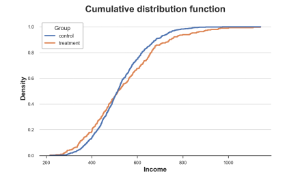
How should we explain this picture?
The two lines are crossing near 0.5 (Y axis), which means that their median is similar
The orange line on the left is on the blue line, and the right side is the opposite, which means that the tail of the processing group is more fat (more extreme value)
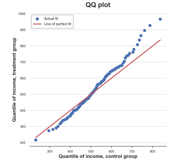
Q-q chart
A related method is the Q-Q chart, where Q represents the division. Q-Q Figure draws out the number of two distributions. If the distribution is the same, you will get a straight line of 45 degrees.
There is no local Q-Q chart function in Python. Although the Statmodels package provides a QQplot function, it is quite troublesome. Therefore, we need to do it manually.
First, we need to use the Percentile function to calculate the quadrangers of the two groups.
Income = df ['Income']. Valuesincome_t = df.loc [df.group == 'timent', 'infome']. Valuesincome_c = df.loc [df.group == == 'Control', 'Income']. Valuesdf_pct = pd.dataframe () df_pct ['q_treatment'] = np.percentile (Income_t, Range (100)) df_pct [ 'q_control'] = NP.Percentile (Income_c, Range (100)) Now we can compare the two segments to each other, plus the 45 degrees line to indicate the benchmark benchmark Perfect fit.
PLT.FIGURE (FIGSIZE = (8, 8)) PLT.SCatter (x = 'q_control', y = 'q_treatment', dta = df_pct, label = 'actual file'); sns.lineplot (x = 'q_control', y = 'q_control', data = df_pct, color = 'r', label = 'line of perfect Fit'); PLT.XLABEL ('Quantile of Income, Control Group') PLT.YLabel ('Quantile of Income, Treatment Group') PLT.LEGEND () PLT.TITLE ("" QQ plot ");
Q-q picture, the picture comes from the author
The Q-Q diagram provides a very similar insight from the cumulative distribution map: the income of the processing group has the same median number (in the center of the center), but the wider tail (point below the left, above the right line).
Two group -inspection
So far, we have seen different methods between visual distribution. The main advantage of visualization is intuitive: we can observe differences through the naked eye and evaluate them intuitively.
However, we may want to evaluate the statistical significance of the difference between distribution more strictly, that is, answering this question "Is the difference observed whether the difference is systematic or due to sampling noise?"
We now analyze different tests to distinguish two distributions.
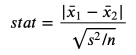
T test
The first and most common test is student T test. The T test is usually used for a relatively average. In this case, we want to test whether the average income distribution of the two groups is the same. The statistics of the test of two average comparison tests are:
T test statistics, the picture comes from the author
The sample average is in the formula, and S is the sample standard deviation. Under gentle conditions, the test statistics are the studs T distribution that is gradually distributed.
We use the ttest_ind function in scipy to perform the T test. This function returns test statistics and hidden P values.
From Scipy.stats Import TTEST_INDSTAT, P_value = TTEST_IND (Income_c, Income_t) Print (F "T-TESTIC = Stat: .4f, P-Value = P_value: .4f") T-Test: Statistics = -1.5549, P-Value = 0.1203
The P value of the inspection is 0.12, so we do not refuse the zero -fake setting of the average value of the processing group and the control group.
Note: The T test assumes that the variance of the two samples is the same, so it is estimated to be calculated on the combined sample. Welch ’s T test allows the two samples to be equal.
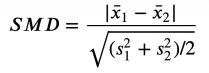
Differences for standardization mean (SMD)
Generally speaking, when we conduct random control tests or A /B tests, it is always a good way to test the average value difference in all variables in the entire processing group and control group.
However, because the nurse of the T -test statistics depends on the amount of samples, the T test is criticized because it makes it difficult for P value to compare across research. In fact, we may obtain significant results in experiments with small differences but large samples, and in an experiment with a large difference but a small sample volume, we may obtain unpredictable results.
A solution that has been proposed is the standardization mean difference (SMD). As the name suggests, this is not a suitable inspection statistics, but just a standardized difference. The formula is as follows: standardization average difference, picture from the author
Generally speaking, the value below 0.1 can be considered "small differences."
The best way is to collect the average value of all variables and the control group, and the distance between the two -either T test or SMD -to a table called a balance table. You can use the Create_table_one function in the causalml library to generate it. As the name of the function implies, when performing the A/B test, the balance table should be the first table you present.
From Causalml.Match Import Create_table_onedf ['Treatment'] = df ['Group'] == 'Treatment'create_table_one (df,' Treatment ', [Genger', 'AgEnter, 'Income'])
Balance table, the picture comes from the author
In the first two columns, we can see the average value of the processing group and the control group, and the standard error in parentheses. In the last column, the value of SMD indicates that the standardization difference between all variables is greater than 0.1, indicating that the two groups may be different.
Mann -Whitney U test

Another optional test is Mann -Whitney U test. Zero fakes are the same powder in the two groups, and the selection assumptions are the value of one group larger (or smaller).
Different from the inspection we have seen before, the Mann -Whitney U test does not pay attention to the abnormal value, but places attention on the center of distribution.
The inspection process is as follows.
1. Merge all data points and sort (upgrade or order)
2. Calculate U₁− = R算n₁ (n₁+ 1)/2, R₁ is the rank of the first group, and N₁ is the number of the first group of data.
3. Calculate the second group of U 计 in a similar method
4. Statistical inspection volume is stat = min (u₁, u₂)
Under the zero -fake setting between the two distributions (that is, the same medium number), the inspection statistics are gradually distributed nearly normal when the mean value and square difference are known.
The intuitive method of calculating R and U is: if the value of the first sample is greater than the value of the second sample, then R₁ = N₁ (N₁+ 1)/2, so U₁ will be zero (the minimum value can be obtained) Essence Otherwise, if the two samples are similar, U₁ and U₂ will be very close to N₁n₂/ 2 (the maximum value can be obtained).
We use the Mannwhitneyu function from Scipy to perform testing.
From Scipy.stats Import MannwhitNeyustat, P_value = Mannwhitneyu (Income_T, Income_c) Print (F "Mann-Whitney u Test: Statistic = STAT: .4f, P-Valuel p_value: .4f ") Mann -Whitney u test: statistic = 106371.5000, P-Value = 0.6012
The P value we get is 0.6, which means that we do not refuse zero fakes, that is, the income distribution of the processing group and the control group is the same.
Note: For the T test, there are two samples that are not equal to Mann-Whitney U test, that is, Brunner-Munzel test.
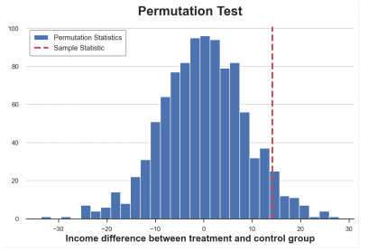
Replacement inspection
A non -parameter selection is a replacement test. The idea is that under the zero leave, the two distributions should be the same, so the mixed group group label should not significantly change any statistics.
We can choose any statistical data and check how the value in the original sample is compared with its distribution in the group arrangement. For example, let's use the sample average difference between the processing group and the control group as the test statistics.
SAMPLE_STAT = np.mean (Income_t) -np.mean (Income_c) stats = np.zeros (1000) for K in Range (1000): labels = np.random.permutation ((df ['group'] == 'timent'). Values) stats [k] = np.mean (infme [labels]) -np.mean (Income [Income [ Labels == false])) p_value = np.mean (stats & sample_stat) prop (F "Permutation Test: P-Value = p_value: .4f") Permutation test: P-value = 0.0530 replacement test gives a P value of 0.053, which means that at a level of 5%, the weakness of the zero fake is not rejected.
How do we explain the p value? This means that the average value of the average value in the data is greater than 1-0.0560 = 94.4%. The sample average value is poor.
We can visually test by drawing the distribution between the test statistics and the sample value.
PLT.HIST (stats, label = 'Permutation startics', bins = 30); PLT.AXVline (x = SAMPLE_STAT, c = 'r', ls = '-', label = 'Sample Statistic'); PLT.Legend (); Plt.xlabel ('Income Differentce BetWeen Treatment and Control Group') PLT.TITLE ('Permutation Test');
The average difference between the replacement is distributed, the picture comes from the author
As we see, the sample statistics value is quite extreme compared to the sample value after arrangement, but it is also reasonable.
Deck test
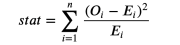
Cardi test is a strong inspection, which is commonly used for the difference in frequency of inspection.
One of the most unknown applications in the card test is to test the similarity between the two distributions. Group the two sets of observation values. If these two distributions are the same, we will expect to have the same observation frequency in each group. The important thing is that we need enough observation values in each group to ensure the effectiveness of the test.
I generate a group corresponding to the income distribution of the control group, and then calculate the expected observation value frequency of each group in each group in the processing group to determine whether the two distributions are the same.
# init dataframedf_bins = pd.dataFrame ()# <# <<, bins = pd.qcut (income_c, q = 10, RETBINS = TRUE) df_bins .cut (Income_c, bins = bins). Value_counts (). Index# Apply bins to bth Groupsdf_bins ['Income_c_observed'] = pd.cut (INCOMESDED_, Income_cu, >bins=bins).value_counts().valuesdf_bins['income_t_observed'] = pd.cut(income_t, bins=bins).value_counts().values# Compute expected frequency in the treatment groupdf_bins['income_t_expected'] = df_bins['income_c_observed'] / np.sum(df_bins['income_c_observed']) * np.sum(df_bins['income_t_observed'] ) DF_BINS packet and frequency, the picture comes from the author
We can now test the expectations of the processing group (E) and the number of observation values (O) in different groups. The test statistics are as follows:
Cardi inspection statistics, the picture comes from the author
Among them, the group is indexed by i, O is the number of data points observed in the first group, and E is the number of data points expected in the first group. Because we use the dwarf digits of the income distribution of the control group to generate a group, we expect that the number of observations in each group in the processing group is the same among each container. The quantity of inspection and statistics is gradually distributed to the deck distribution.
In order to calculate the P value of the test statistics and inspection, we use the chisquare function from Scipy.

from scipy.stats import chisquarestat, p_value = chisquare(df_bins['income_t_observed'], df_bins['income_t_expected'])print(f"Chi-squared Test: statistic=stat:.4f , P- value = p_value: .4f ") Chi-Squared Test: Statistic = 32.1432, P-Value = 0.0002
Different from all other tests, the deck test strongly rejected the same zero assumptions with the same distribution. why?
The reason is that the two distributions have a similar center, but the tail is different. The derivative test is the similarity of the entire distribution, not only in the center as before.
This result tells us: Before P is worth the blind conclusion, understand what you actually test is very important!
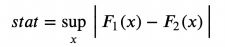
Kolmogorov-SMIRNOV test
Kolmogorov-SMIRNOV test may be the most popular non-parameter test. The idea of Kolmogorov-SmiRNOV test is a cumulative distribution of the two groups. In particular, Kolmogorov-SMIRNOV test statistics are the biggest absolute difference between the two cumulative distribution.
Kolmogorov-Smirnov inspection statistics, the picture comes from the author
Among them, F₁ and F 个 are two cumulative distribution functions, and x is the value of the base variable. The gradual distribution of Kolmogorov-Smirnov test statistics is the Kolmogorov distribution.
In order to better understand the test, let us draw cumulative distribution functions and test statistics. First, we calculate the cumulative distribution function.
df_ks = pd.dataFrame () df_ks ['Income'] = np.sort (df ['income']. unique ()) df_ks ['f_control'] = df_ks ['Income '] .apply (lambda x: np.mean (Income_c <= x) df_ks [' f_treatment '] = df_ks [' income ']. > NP.Mean (Income_t <= x)) df_ks.head () Cumulative distributed data set snapshot, the picture comes from the author
We now need to find the most absolute distance between cumulative distribution letters.
k = np.argmax (np.abs (df_ks ['f_control'] -df_ks ['f_treatment'])) ks_stat = np.abs (df_ks ['f_treatment'] [k] -df_ks ['f_control'] [k]
We can visually test the value of the statistical quantity by drawing the values of two cumulative distribution functions and test statistics.
y = (df_ks ['f_treatment'] [k] + df_ks ['f_control'] [k]/2plt.plot ('income', 'f_control', data = df_ks, Label = 'Control') PLT.Plot ('Income', 'F_Treatment', Data = DF_KS, Label = 'Treatment') PLT.ERRORBAR (x = df_ks ['Income'] [K] [K] , y = y, yerr = KS_STAT/2, color = 'k', capsize = 5, meW = 3, label = f "test statistics: KS_STAT: .4f ") PLT.Legend (LOC = 'Center Right'); PLT.TITLE (" Kolmogorov-Smirnov Test ");
Kolmogorov-Smirnov inspection statistics, the picture comes from the author

From the figure, we can see that the value of the test statistics corresponds to the distance between the two cumulative distribution at 650. In terms of income value, the imbalance between the two groups is the largest.
Now we can use the KSEST function from Scipy to perform actual tests.
From Scipy.stats Import Kseststat, P_value = KSTSTST (Income_T, Income_c) Print (F "
P value below 5%: We reject two zero assumptions with the same distribution with 95%confidence.
Note 1: The KS test is too conservative and rarely refuses zero fake. LillieFors tests the deviation of different distributions (LILLIEFORS distribution) of test statistics.

Note 2: The information used in the KS test is very small, because it only compares the two cumulative distributions at one point: one of the maximum distance. The Anderson-Darling inspection and Cramér-Vonmises test compare the two distributions in the entire domain through points (the difference between the two lies in the weighted by the square distance).
Multi-group-picture
So far, we only consider the situation of the two groups: the processing group and the control group. But what if we have multiple groups? Some of the methods we see can be expanded well, while others are not good.
As a feasible example, we now check whether the income distribution of different processing groups is the same.
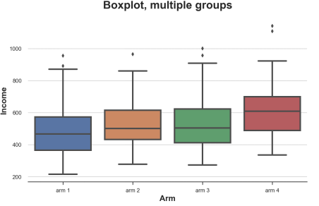
Box diagram
When we have many digits, the box diagram can be scaled well because we can discharge different boxes together.
Sns.Boxplot (x = 'ARM', Y = 'Income', Data = df.sort_values ('ARM')); PLT.TITLE ("Boxplot, Multiple Groups"); Different processing of the revenue distribution of the sub -group, the picture comes from the author
It can be seen from the figure that the income distribution of different groups is different. The higher the number of groups, the higher the average income.
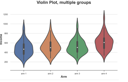
Violin map
A good expansion of the box diagram combined with the presidential and nuclear density estimates is the violin map. The piano map shows the independence density along the Y axis, so they will not overlap. By default, it also adds a micro -box diagram inside.
Sns.violinplot (x = 'ARM', Y = 'Income', Data = DF.SORT_VALUES ('ARM')); PLT.TITLE ("VIOLIN plot, multiple groups") ;
Different processing sub -group income distribution, the picture comes from the author
Compared with the box diagram, the violin map can indicate that the income of different processing groups is different.
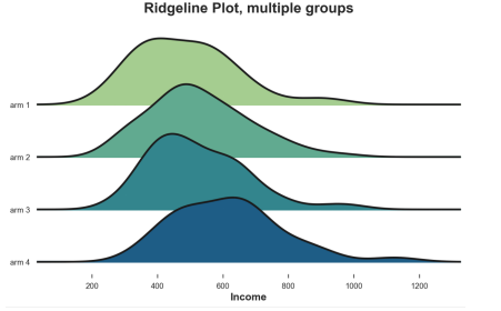
Spine
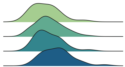
Finally, the ridge line diagram draws multiple nuclear density distribution along the X axis, which is more intuitive than the violin map, but partial overlap. Unfortunately, there are no default ridge diagrams in Matplotlib and Seaborn. We need to import it from Joypy.
From Joypy Import JoyplotJoyplot (df, by = 'ARM', Colmn = 'Income', colorMap = Sns.color_palette ("crest", as_cmap = TRUE)); Income '); PLT.TITLE ("Ridgeline Plot, Multiple Groups");
Different processing sub -group income distribution, the picture comes from the author
Similarly, the ridge diagram shows that the higher the number of treatment groups, the higher the income. From this figure, it is easier to understand the different shapes of the distribution.
Multi-group-inspection
Finally, let's consider the assumption of the test to compare multiple groups. For simplicity, we will focus on the most commonly used: F test.
F-test
For multiple groups, the most commonly used test is F test. F tests the difference between a variable between a variable between different groups. This analysis is also known as a variance analysis, or Anova.
In practical applications, the statistics of F inspection
F test statistics, the picture comes from the author
The number of G is the number of groups, n is the number of observations, the overall average, and G is the average value of the G group. Under the group independence zero fake, F statistics are distributed.
From scipy.stats import f_onewayincome_groups = [df.loc [df ['aRM'] == ARM, 'Income']. Values for arm in df ['arm']. ) .Unique ()] Stat, p_value = F_ONEWAY (*Income_groups) Print (f "f test: statistic = STAT: .4f, p-value = P_value :. 4F ") F test: Statistic = 9.0911, P-Value = 0.0000
The test P value is basically zero, which means that there is no difference in revenue distribution between the treatment groups.
in conclusion
In this article, we have seen a lot of different methods to compare two or more distributions, whether visually or statistics. This is the main focus of many applications, especially in causal inference. We use randomized methods to make the processing group and control group as comparable as possible.
We also see that different methods may be more suitable for different situations. The visualization method helps to establish intuition, but the statistical method is important for decision -making, because we need to evaluate the difference in magnitude and statistical significance of differences.
references
[1] Student, The Probable Error of a Mean (1908), biometrika.
[2] F. Wilcoxon, Individual Comparisons by Ranking Methods (1945), Biometrics Bulletin.
Other (1947), The Annals of Mathematical Statistics.
[5] E. Brunner, U. Munzen, The NONPARAMETRIC BeEHRENS-FISHER PROBLEM: Asymptotic theory and a Small-Samproximation (2000), Biometrical Journal.
[6] A. N. Kolmogorov, Sulla determinazion Empirica Di UNA Legge Di Distribuzione (1933), giorn. ISt. Attuar ..
[7] H. Cramér, on the Composition of Elementary Elega (1928), Scandinavian Actuarial Journal.
[8] R. Von Mises, Wahrscheinlichkeit Statistik Und Wahrheit (1936), Bulletin of the American Mathematical Society.
[9] T. W. Anderson, D. A. Darling, Asymptotic Theory of Certain "Goodness of Fit" Criteria Based on Stochastic Processses (1953), The Anals of Mathematical Statistics.
- END -
Quite huge, this big magnetic road has arrested a small earth, we may be trapped in the magnetic tunnel

Magnetic wires may surround our planet/Our earth may be surrounded by magnetic wir...
Xiaomi responded: true

Foreign media said Xiaomi produces smart phones in Vietnam, Xiaomi responded: true...