B -side visual trend analysis
Author:Everyone is a product manager Time:2022.06.27
Edit Introduction: Affected by the major environment, lifestyle changes, and many demand scenarios have also moved from offline to online. The author of this article analyzes the relevant content of B -end visual trends. From 3D, data visualization, aurora gradient, emotional design, micro -acting, etc., let's take a look interested. I hope it will be helpful to you.

In recent years, the epidemic has been raging all over the world, and the inconvenience of travel and the "no contact" lifestyle has affected our habits to a certain extent. The online "national fitness" tide caused by Liu Genghong can be seen. Turning down to the line, the blockade and isolation make our time longer in the digital world.
Based on the experience of the team's daily work in the past year, we have explored and analyzed the design style of B -end product. This article is the design style of the B -end products that we summarize.
I hope that through this summary, we can better learn from designer friends, and at the same time, I hope that the members of the project team of the B -end will better recognize the trend of B -side products and reach an agreement on the direction and goals.
One, 3D
Has the traditional single 2D design has caused you aesthetic fatigue?
Although the 3D visual style has already arrived, the performance in the B -end market is still very restrained.
In recent years, the upgrade of hardware equipment has provided a solid backing to 3D design. The popularity of 5G has also made the 3D design effect easier to integrate into life.
Features:
Three -dimensional truth: Compared with 2D, 3D graphics can show more realistic three -dimensional effects. Rich in the form: 3D can perform richer and more complex forms, show more details, and can realize certain interaction. From the above two points, the performance of 3D is closer to our perception and more visual impact.
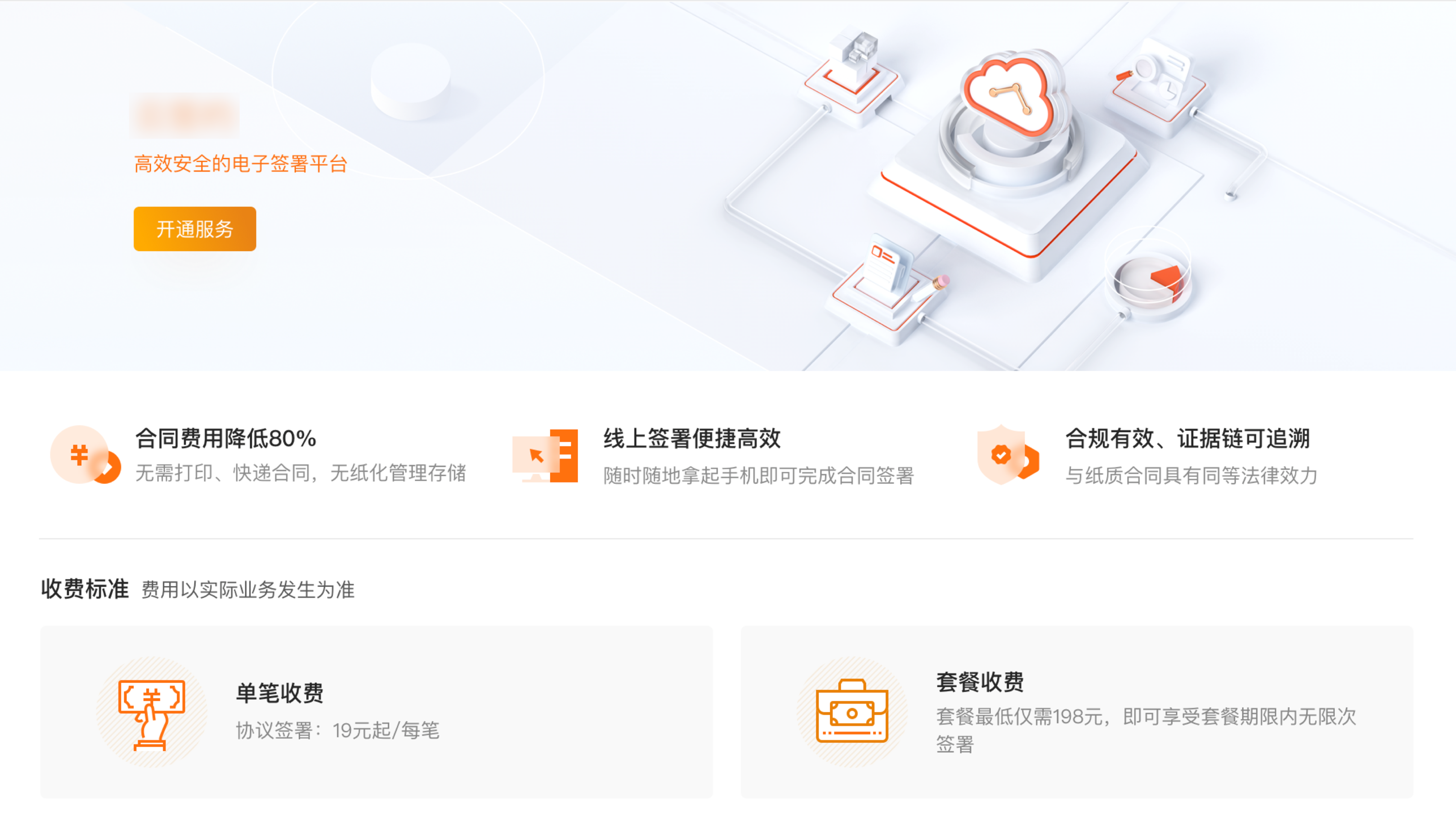
In the B -end financial product design, 3D elements can be used for web -side homepage, APP -side guidance pages, etc., which need to reflect strong visual impact to enhance the sense of high -level pages.
The 3D icon is also brilliant on the pages of the workbench, the operating toolbox. In addition, the design of large screens is also extending to 3D.
In the project, we applied 3D animation in the APP guidance page, breaking through the visual style of traditional financial B -end products, bringing visual impact to users, and allowing users to focus more on the selling point of the product.
In the future, 3D elements will also be widely used in operating landing pages and pop -ups. From the perspective of collaborative work, improvement efficiency and unified design pace, establishing a 3D component library is also one of our necessary tasks.
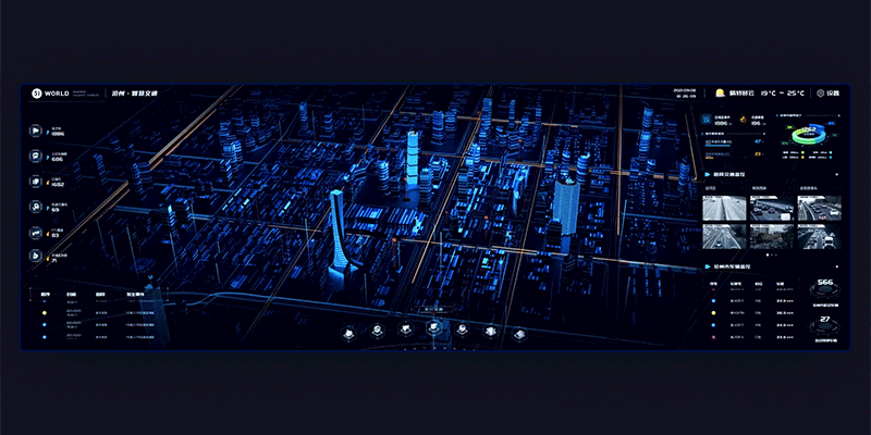
Data visualization
The processing data has always been the core task of B -end products. In this era when the inner rolls are becoming more and more serious, the task of visualization of data has become increasingly difficult.
The original data is abstract, complicated, boring, professional, and not intuitive. So how can users quickly obtain key data to make the next decision?
The visual design of data allows users to focus on key information, improve user work efficiency, and change the operating efficiency of the enterprise.
Judging from the needs of data visualization, its advantage is obvious, which can reduce the three major costs of users in product use:
Reduce recognition costs: The visual language of graphic image can instinctively put down the psychological pressure on data and make users understand more easily. Reduce analysis costs: The association between data and data can reduce the difficulty of analyzing its potential relationship through intuitive graphic expression. Reduce communication costs: The information carried by the diagram method is more abundant, the form is more deeply rooted in the hearts, and the recognition in communication between people is also higher.
(The material comes from the Internet)
In the design of the B -end financial product design, data visualization is more common in data overview of the PC background, data visualization of large screens, real -time monitoring of background, and mobile end background statistics.
In the future, we also plan to see data visual exploration and use in the introduction of wealth management products, asset views and other scenarios.
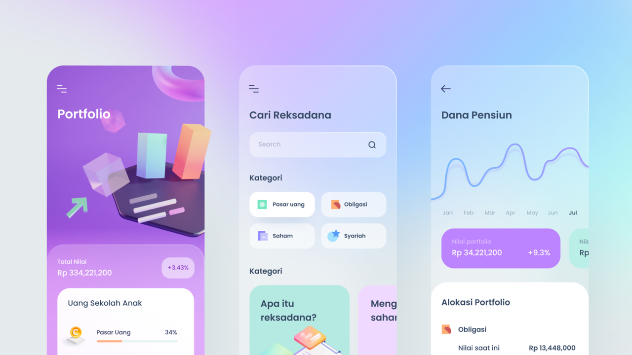
Third, Aurora Gravity
Under the premise of meeting the underlying needs of B -end product design, do you want to further improve your sensory experience when using the product?
Regardless of designers and users, we all hope that the product can maintain both the order of functional levels and strengthen the permeability and texture at the visual level.
Therefore, too strong gradual changes are no longer a trend, and the low -key, gentle, fresh and happy visual style is gradually becoming popular. Considering that B -side users need to be such a relaxed and mild visual environment, "Aurora Gradient" is more suitable.
Features:
Transparent and fresh: Lightweight gradients will choose neighbor colors with high brightness and low saturation, so they can express the "breathing feeling" well. Lightweight and soft: Aurora gradient and micro gradient are the same source. Its characteristics are adjacent to the gradient color, soft amplitude, and strong fusion and delicateness. Rich levels: Compared to solid color, the soft and gradient background of the aurora style is more advantageous.
(The material comes from the Internet)
In the B -end financial product design, the pages or card background enhanced are mainly used on the mobile terminal, such as navigation bars, personal centers, pop -ups, search boxes, labels, etc.; The color of the element and the change of light and shadow.
Fourth, emotional design
In your impression, is the traditional B -end product boring and rigid?
Haraya once mentioned a concept: let the sensory be re -discovered. "The designer should not rush to draw sketches, but think about the user's feelings first." In fact, B -side products are also slowly changing. You are also an emotional "person" with B -end products. Therefore, the design of B -end products must not only understand the user's usage habits, but also consider the user's emotional experience and experience.
Effective emotional design has the following characteristics:
Positive incentive: Maintain the user's sense of expectations, strengthen trust and joy, improve surprises and pride. Negativeness: reduce doubts and anxiety, and ease the frustration of users during use. Effective guidance: Good emotional design can effectively guide users' behavior and allow users to take less detours.
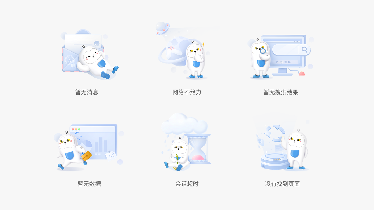
In the design of the B -end financial product design, the emotional design can be reflected in the application of the IP mascot in the page, such as the relaxed and interesting illustrations on the error and the lack of pages, and combined with human emotional copywriting APP has widely used the IP image Xiaobao to strengthen the affinity of the product, and add more emotional designs to the default pages and process guidance.
In addition, lightweight social interaction, such as sending birthday wishes, thanks to the letter, and adding the impression of each other, is also an expression of emotional design.
Five, micro -motion effect
In the user experience design, micro -sexual interconnection becomes increasingly important, and the silky dynamic design is the soul of micro -interaction. Even if it is only a tiny visual prompt or feedback, it is the key to make the product easy to use.
In the boring and complicated B -terminal page, micro -movement has become the strength of the "page atmosphere group".
In the page, micro -motion effects played from three levels:
Improve coherence: Let the interface elements transform and transition smoothly in the business process, guide the user's operating task results, and guide them to perform complex operations. Connecting scenarios: Play the role of lubricant in the process of converting scenes, clarify the relationship between the location, level and space between the scenes. Visual attraction: Focusing on user sight, focusing on important things, thereby playing the role of information transmission and improving recognition, and also gives users a sense of enjoyment.
In the design of B -end financial products, micro -motion is suitable for clicking feedback, loading waiting, navigation bar interactive, important functional entrances, page background atmosphere creation, and so on.
At present, micro -movement effects in actual projects are mainly used in pages or components to load waiting, third -party transition jumps and other scenarios. high.
6. Video application to B -end products
With the comprehensive popularization of 5G technology and the rapid rise of short videos, user content consumption is fragmented and diversified, so the content of videoization is gradually loved by users.
Features:
Feeling intuitive: Compared with graphic form, the video -based experience will be more intuitive and easier to understand. Easy to read: In terms of display forms, videos have more innate advantages than text and pictures. Video -based content will be easier to read and memorize users.
In the B -end financial product design, in addition to helping users' operating manuals can make videos, some functional guidelines or introduction can also be made into short video forms. The guidance page that enters the APP for the first time can be made into a cool video to replace static static Pages, and the H5 of the marketing category can also be interspersed with some videos.
At present, the new guidelines for the web project have been fully video display, and the APP has also introduced loans, financial management, and bill products through video display methods. In the future, it will be applied to more scenarios.
Seven, Summary
The annual design trend seems to be similar. In 2022, it is the premise of meeting the aesthetic needs of B -end users. It focuses more on content and emotional expression. Rich experience.
B -end products are close to C -end products in the use of experience and visual experience, which is the concept of "B -end C" we often mentioned recently.
However, from the perspective of the designer, whether it is the design trend of the B -side or the C -end, the ultimate goal is to solve the problems encountered in the business scenario. The use objects are human, and they should consider problems from the perspective of "human nature".
At the same time, the design trend has been in rapid changes. Over time, more new technologies will be ushered in in the future.
As designers, no matter what trends are popular, the most important thing is to find the direction that we are passionate and good at, learn and use it reasonably to generate the maximum design value.
Author: Wowdesign, study the maximum research design, involves user experience, brand experience, space experience.
This article was originally published by @WowDesign. Everyone is a product manager. Reprinting is prohibited without permission.
The question map is from UNSPLASH, based on the CC0 protocol.
- END -
The harm of plastics is unprecedented, and biological plastics are more likely to induce biological errors!

Science Fiction Network July 4th (Liu Yazhu) As we all know, plastic fragments and...
"Mu Xi" completes 1 billion yuan Pre-B round financing
According to the news on the 5th, Mu Xi Integrated Circuit (Shanghai) Co., Ltd. an...