Popular number said | Application scenarios of vertical line map
Author:Popular number new observation Time:2022.08.26
The folding diagram is a chart type commonly used in the process of data visualization. Because of its intuitive display of the advantages of variable change trends, it is widely used in multiple fields. The common line diagrams are mostly horizontal folding diagrams. Based on the X -axis, the adjacent variables on the X axis are connected by a straight line, which visually manifested as the horizontal fluctuation of the folding line. The vertical line diagram is relatively rare.
In this issue, based on a survey initiated by Nick Desbarats under Twitter's #Dataviz topic, discuss the reasons for the relatively difficult to read vertical line diagram and vertical line diagram as the best choice.
Nick initially said that there was a skeptical attitude towards vertical folding diagrams, because for most users, the vertical line map was not intuitive, especially compared with the more common horizontal line diagram, people often thought The folding diagram is easier to read than the vertical line diagram on the right.
01
The reason why the vertical version is more difficult to read
Reading habits from left to right:
对于母语是一种从左到右阅读的语言的人群而言,数千个小时对阅读的学习,训练了大脑默认从左到右的阅读模式(而不是从上到下,从下到上, Or from right to left). Existing research supports such a point: Mother tongue will affect the way people psychologically default the sequence.
After reading from left to right, readers no longer need to consciously remind themselves the "direction" of the horizontal line map. However, in the vertical line map, the reader must first determine the reading order from bottom to top or top, and consciously reminds himself the "direction" of the chart during reading.
The larger number of "high" thinking inertia:
In the real world, the more the number of things usually "higher" (such as a pile of bricks), which may be subjectively believed that the higher elements in the chart (the point on the line, the end of the bar chart, etc.) represent There are more elements in the quantity than in the chart. Therefore, in the horizontal folding diagram, an upward straight line is immediately considered to represent the increase in quantity. However, in the vertical line diagram, the increase in quantity is usually expressed as a straight line of "tilt right", which is not very intuitive. In this case, the horizontal folding diagram can usually be quickly determined to increase and decrease, and the vertical line map may be twisted back and forth at first glance, but this is not actually representative of the data.
Horizontal folding diagram is more commonly caused by folding line chart horizontal reading habits:
The above two reasons tried to explain why the vast majority of the folding diagram was horizontal. Conversely, this means that most readers are accustomed to reading the line map horizontally, not vertical reading. In fact, many data visual software applications (including Excel) do not even provide vertical line charts as native chart types.
The lines in most folding diagrams include many separate line segments, so in the vertical line diagram, readers need to consciously remind themselves the significance of the slope of each line. For each line segment, this thinking only takes a few minutes, but for a typical line map, this process becomes complicated and tedious in the situation of many line segments, which makes it difficult to cause readers' interest and reduce it. Slowly understand the speed. This additional cognitive efforts are particularly significant in more "messy" and more data.
What changed the view of Nick Desbarats on vertical schematic diagrams? Twitter users' response to his original tweet was roughly divided into the following three categories, and some different types of responses and Nick Desbarats were selected. The recovery content from different users shows the individual differences in different perspectives, and the overall awareness of the vertical line diagram is constructed.
02
No reply to Nick thoughts
"There is no reason to avoid vertical folding maps; they are easy to read as the level."
Although this is not a common answer, it does say that. This is inconsistent with what I observed when I show vertical line maps to thousands of seminars, but I think different views should be accepted.
"Some types of data are considered 'vertical', such as data related to height or depth. These data should be displayed on the vertical scale."
I agree. It should be noted that I am not questioning whether the data should be displayed vertically. I am questioning whether the vertical line diagram is the best choice. This is another problem. Other types of "vertical" charts, such as vertical hotspots, horizontal strips, etc., there are no perception issues described above. I agree to show the data of "vertical" (height, altitude, depth, etc.) that people think of "vertical" (height, altitude, depth, etc.) should usually be vertically vertical. Properly appear.
"People will use vertical line maps."
The question I asked is not "Can people use vertical line charts?" (I know they will.), "Compared with horizontal diagrams, strip charts, hot spots, etc. Situation? "In fact, people's use of vertical line diagrams in some cases does not necessarily mean that it is the optimal choice in these cases. People always make problematic data visual design choices.
"Vertical line diagram is very useful."
I don't say that vertical line diagrams are useless, they may be useful. My problem is that in some cases, whether the vertical line diagram is the optimal choice compared with the horizontal line diagram, horizontal bar chart, and vertical hotspot diagram.
"Each type of chart (including vertical lines) has its own best choice." In my previous survey, I heard several such claims, but to be honest, I don't understand. The type of chart is the invention of human beings, but some things are invented, which does not mean that it must exist that it is the best solution. There are countless human inventions that do not have the best application. I can think of many types of charts. They are not real optimal choices in any reasonable situation.
"My organization uses vertical line charts, and people are satisfied with this." Or "I work with experts, and they can easily master the vertical line chart."
If given users are accustomed to presenting data in some way, this does not necessarily mean that it is the most effective way to present data. If you use another way early and people are used to this method, maybe everyone will live better today. Of course, we should not ignore the content that people are accustomed to seeing when designing charts; I just say that "the way people are used to" and "the most effective way" are not the same thing.
"The vertical line diagram is more suitable for the long folding line diagram viewed on the mobile device with a longitudinal mode."
This issue has triggered some particularly interesting discussions. Some people point out that the chart should be vertical for a very long folding diagram (that is, not suitable for mobile phone screens), because people are accustomed to sliding/rolling on the mobile phone (that is, viewing the entire chart). Others refute that horizontal sliding/rolling is no stranger to mobile phone users, so the long -level folding diagram can be used on the mobile phone, but the vertical line diagram is not intuitive. In the end, this is a situation of "choosing your poison": either violates the expectations of how people should determine the direction of the line diagram, or it violates their expectations of how to determine the direction on the screen of mobile phone screens.
03
Other chart types will be a better example
Some users have released examples of using vertical folding diagrams, but Nick believes that if it is a horizontal folding diagram, hot spot map or horizontal bar chart, the effect may be better.
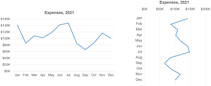
Vertical line map that can be replaced by horizontal folding drawings:
Some people have released an example of vertical line diagram with a lot of lengthy annotations. They believe that these charts are not suitable for horizontal folding diagrams, because if the chart is horizontal, the lengthy annotations are not "suitable". For example, someone posted this amazing 1897 chart, which tells the American civil war with multiple vertical line charts and many lengthy notes:
Some people have released this more extreme example. The classic and huge vertical folding line chart includes the global average temperature since 20000 BC (the bottom part of the chart only shows the bottom part of the chart):

But Nick does not think that the use of these vertical line diagrams is convincing. He believes that even horizontal folding diagrams can at least achieve similar effects. There are many examples of detailed comments, very wide, and scroll horizontal folding charts, which seem to be effective (even more effective because they are horizontal, with the advantages of the horizontal line diagram discussed before):

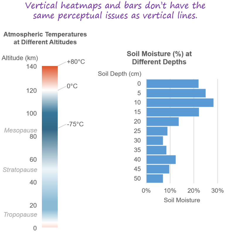
Vertical line chart that can be replaced by hot maps:
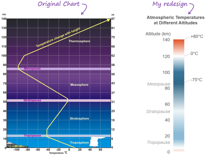
The atmospheric temperature heat map displayed earlier is actually a redesigned vertical line map that was redesigned:
This does not mean that the original vertical line diagram is "wrong" or "useless", but most readers will master vertical hotspots faster and easier to grasp the vertical hotspot more than vertical scattered. Even though the hotspot diagram is not as precise as the folding diagram, it may be harmless in this case, because these atmospheric temperature values may only be the average, and it changes with time and position anyway.
Vertical line chart that can be replaced by horizontal bar chart:
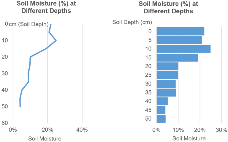
The soil humidity horizontal diagram displayed before is also redesigned the vertical line diagram of the same data. It is easy to find that the strip version is easier to understand than the vertical version:
It is not that the vertical line diagram is "wrong" or "useless", but in this case, it is more troublesome and not intuitive than the cognitive diagram.
04
Vertical line diagram is an example of the best solution in this situation
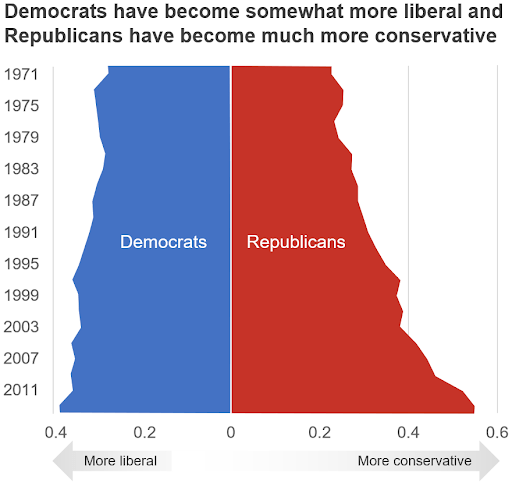
The diagram provided by Ben Jones expresses this point clearly: In this case, the display of data as horizontal folding diagram is not helpful for data presentation effects.
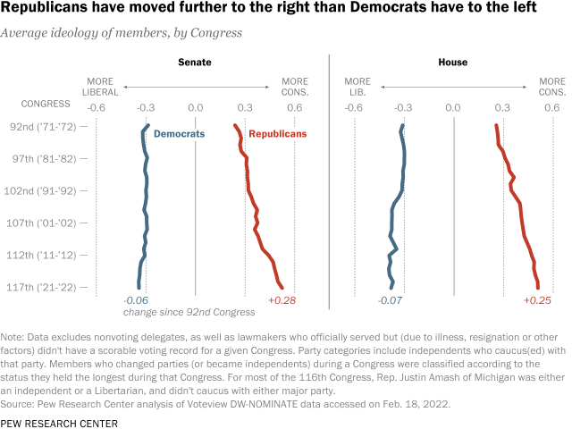
There are two major problems in Nick this chart:
1. Because most people think that the larger quantity is "higher", it seems that the number of CCP and the party has been "increased", and the Democratic Party has been "decreasing", but this is not the meaning of this data.
2. It does not reflect the psychological representation of many readers' "left" (in this chart) and conservatives as "right" ("up").
After that, he tracked the original data of these charts and conducted some research on it. The following conclusions were drawn:
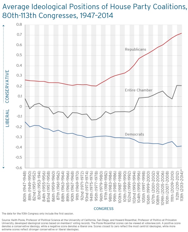
This level version has been greatly improved compared to before, but compared with the original vertical line diagram, it has advantages and disadvantages.
Compared with the original vertical line chart, the advantage is:
1. It is easier to read;
2. The focus in the title is more prominent;
3. Over time, the two parties have become more and more "extreme".
Compared with the original vertical line diagram, the disadvantage is:
1. It does not reflect the psychological representation of many readers' liberalism and right conservatives of the left;
2. As a dual -axis chart, readers need to realize that quantitative standards are different for blue lines and red lines; 3. The phenomenon of "getting away and gradually" in ideology is not so obvious.
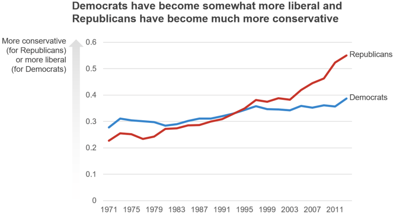
Nick is more referred to as "draw". Based on the accurate description of data, vertical line diagrams may be the best choice in these two options.
Compared with the original vertical folding diagram, the advantage of this version is that it shows that the two measurement values are increasing, because "widening" is more obvious than "leaving the left" or "tilt right". In the original vertical line map, the Democratic Party looks like "decline", but this is not the case in this version.
From the NICK found that filling in the area below the vertical line diagram can reduce many perception problems and make them easier to read, because increasing and decreased are more obvious. Perhaps it is not as easy to read as the horizontal chart, but it is much easier than the conventional vertical line diagram.
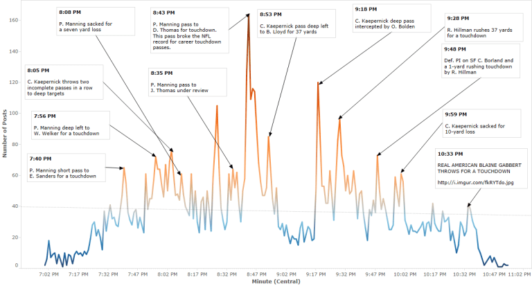
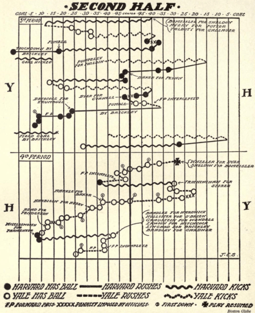
After RJ Andrews sent this retro vertical line chart, showing the sport of the ball in the football game:
If this is a horizontal folding diagram, it looks like the ball "moves up and down" on the venue, rather than "move back and forth" like the rugby competition imagined by the audience, so the vertical line chart is the optimal choice, not the horizontal folding diagram, not the horizontal line diagram, Hot diagrams or bar charts, which may be a good example of vertical folding diagram.
Someone subsequently released this rig data chart, showing various geological measurement indicators (humidity, resistance, etc.) that deepen the deep detection of different drills:
Nick believes that it is meaningful to display such data on the vertical scale, because almost everyone thinks that the soil depth is "vertical". So is there a hot spot, column diagram, or other "vertical" charts better than vertical folding diagrams?
The judgment of NICK is the accuracy that readers who cannot provide such data cannot provide such data. At the same time, there is a problem of "density" in information: there are many values in this chart, and the hotspot or bar chart may be more difficult to understand than the line, because it is too dense, making it difficult to visual analysis. Secondly, some indicators are drawn on the same scale, which indicates that high -precision comparisons may require. If this is the case, the hotspot or bar chart will make this contrast more difficult.

TIAGO MARANHAO subsequently published an article on Roger Federer tennis career, one of which has a vertical line diagram and a detailed text narrative, showing the changes in the world ranking with the reader's rolling text description.
05
Summarize

Involved in chart design, Nick Desbarats mentioned its understanding of vertical line maps:
The vertical line diagram is not "wrong." They will not distort their data, and most readers will know how to read them. Even though another chart type may be a better choice, these examples are still "applicable" on vertical line charts;
You can consider using the vertical line diagram to visualize the readers' "left and right" (such as political ideology) or "upper and lower" (such as soil depth);
The vertical line diagram is more troublesome than the horizontal line diagram or other "vertical" chart types (such as vertical hotspots or horizontal bar charts);
If the more intuitive chart type is not effective, and the vertical line chart seems to be the best (or unique) choice. Considering the area below the folding line to make the "growth direction" more obvious visually.
Reference materials:
[1] https://nightingaledvs.com/are- version-charts-ever-a-good- IDea//
[2] https://www.ncbi.nlm.nih.gov/pmc/articleS/pmc3322406/
[3] https://twitter.com/nickdesb/status/1527296330514636801
[4] https://www.pracTicalReporting.com/blog/2021/11/14/the-biggest-misconception-in-data-Visualization
- END -
Beijing · Cao Xueqin's Former Residence Memorial Hall

Picture source: Cao Xueqin's former residence Memorial HallAfter 22 years of cultu...
Photography skills: How many of the 6 major composition techniques of architectural photography have you mastered?
Photography skills: How many of the 6 major composition techniques of architectura...