Don't use the cake picture anymore. Today, I will teach you to make a simple water wave map, so that the boss's eyes are bright!
Author:Excel from zero to one Time:2022.09.24
Hello, everyone, today I will share with you how we make a creative water wave map in Excel. It is often used to show the completion rate of data. It is named because it looks like water waves. Make it!

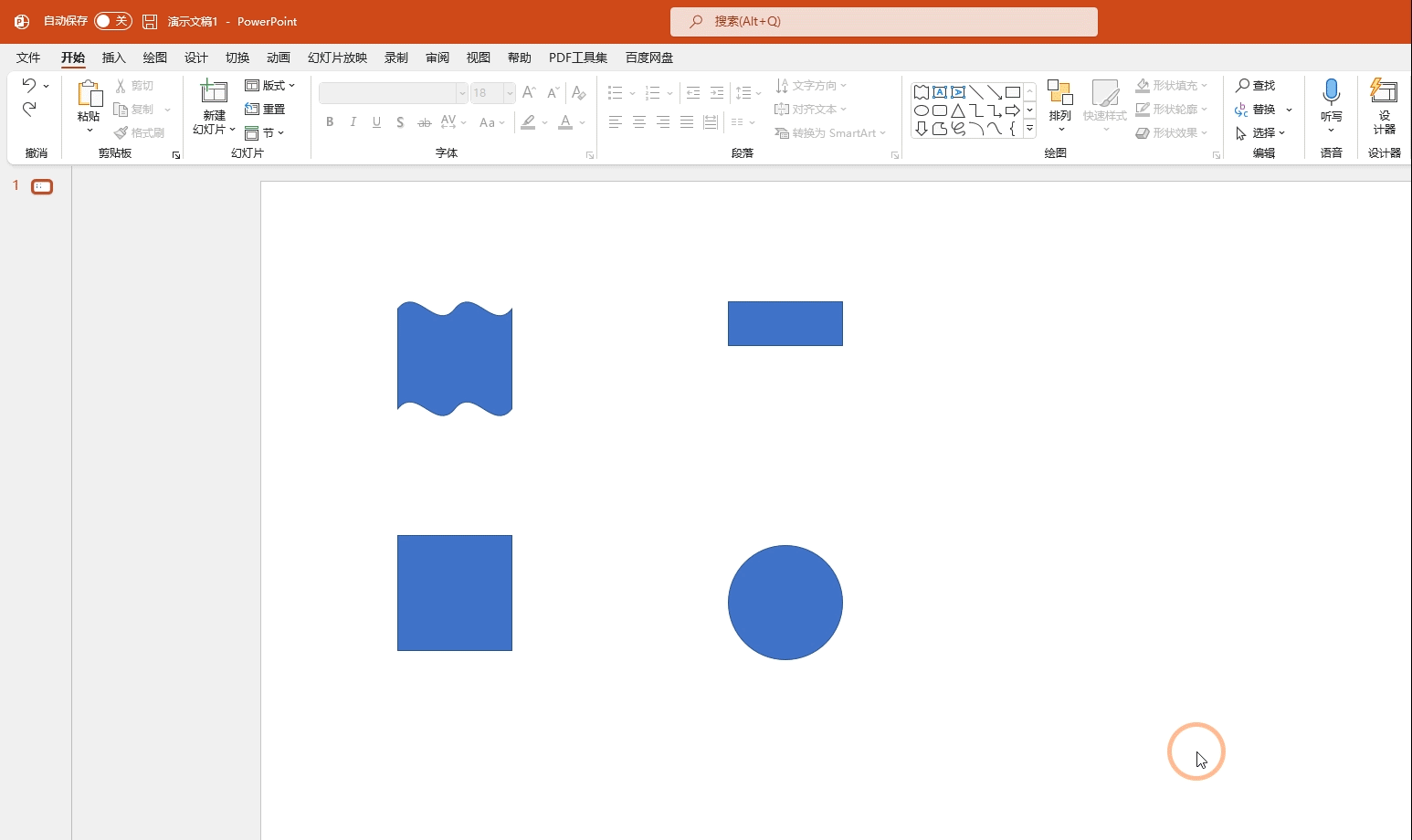
1. Build shape
To make water wave maps, we need to use PPT to build 2 shapes. As shown in the figure below, we need to build a water wave shape and a hollow rectangle
These shapes are inserted in [Insert shape]. There are 2 key points for making these two graphics
1. Water waves need to use the square to block the waves below, and the combined shape needs to be set to [combined]
2. The hollow square is complete and complete. The combined shape needs to be set to [Combination]
After these two shapes are completed, we only need to copy them and paste it to Excel
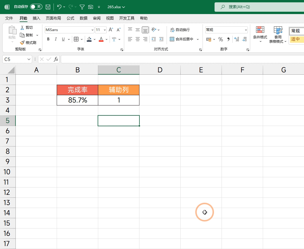
Second, build chart
You need to enter the number 1 after the completion rate, it is the auxiliary data, indicating the 100%completion rate
After these two data, click [Insert] to select [Pillar Chart] in the table
After generating the column -shaped diagram, we need to click [Switch List] to switch the position of the graph
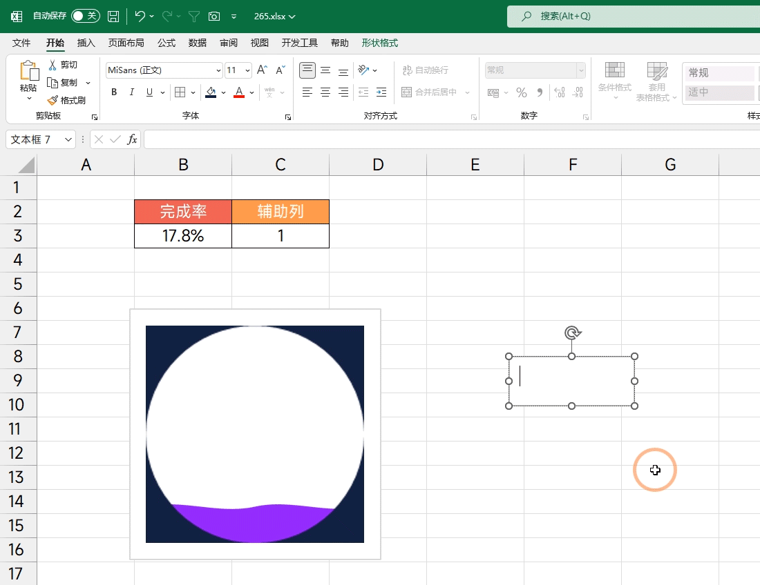
Third, paste shape
Before sticking the shape, you need to pay attention to 2 points,
1. The filling color of [hollow square] determines the fill color of the background
2. The filling color of the water wave determines the fill color of the water wave in the chart
So what color do this need to be planned in advance, and it cannot be changed later. After setting the color, you can start making
First press Ctrl+V Copy [Wave] Click [Purple Pillar] to indicate [Actual completion rate] Press Ctrl+V paste
After the same operation, copy the [hollow square] paste it to another pillar diagram
Press the shortcut key CTRL+1, spread the setting window, set the [series to 100%], [to be set to 0]
Finally, delete both the coordinate axis and the grid line, and then set the size of the chart to a square size

Fourth, add data tags
Insert a text, then select the Chinese frame, enter = B3 in the editorial column, and then click Enter to display the specific completion rate in the text box. Then set the shape of the text box and the outline to be set to no. Select a suitable font and place it in the middle of the chart.
Five, beautify combination
You need to select the chart first, set the fill color of the chart to the frame color of the frame to no
Then select the cell area where the chart is located, and set the color of this area to set the same color as the [hollow square]
Then insert a circular shape, set its fill color to no, and then set a suitable border color for it, increase the thickness of the border, and then place it in a suitable position.

The above is all the content shared today, how about? Have you learned it?
I am Excel from zero to one, follow me, and continue to share more Excel skills
If you want to learn excel, improve work efficiency
Here ↓↓↓↓
- END -
Fun sleeping technology sprint ipo: over 60%of the income comes from the Xiaomi platform, the research and development cost and gross profit margin are lower than the same value

Picture source: Oriental ICRecently, the CSRC approved the first public issuance a...
Help people buy tickets, the new policy is coming!

Travel with friends and relativesEveryone gave you the heavy responsibility of buy...