Heilongjiang Provincial Cultural Tourism Image LOGO releases into 18 regional characteristic elements
Author:Heilongjiang Daily Time:2022.08.31
On August 30, the Heilongjiang Provincial Department of Cultural Travision held a press conference to release the name of the Heilongjiang Cultural Tourism Image LOGO and the official promotion platform name "Better Reward Heilongjiang".
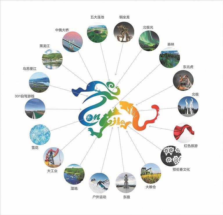
Heilongjiang Provincial Cultural Tourism Image LOGO is the core of "Dragon Teng and Tiger, Burning Top, Create the Future" as a carrier with the word "Heilongjiang" three words "Heilongjiang". The overall design inspiration comes from the national first -class cultural relics "copper sitting dragon", which incorporates 18 special elements that have the characteristics of economic and cultural tourism in Heilongjiang.
According to reports, the LOGO's leading part is incorporated into the five Dalianchi, Heilongjiang, Ussuri River, and Aurora elements. Through freehand methods, the outline characteristics of the three are combined with the LOGO; ; Dragon's neck uses snowflakes representing Heilongjiang's winter tourism, a large industry symbolizing "Daqing Spirit and the Spirit of the Iron Man" and the "Drunk Beauty Longjiang 331 Border Road" elements; the dragon body uses wetlands and forest elements to show Heilongjiang as the whole country as the whole country Wetland provinces and forest coverage are the top natural advantages in the country's ranking; Longjiang's "J" is transformed into an outdoor sports form, reflecting the prosperity and development of Longjiang ice and snow sports; Showing; the landmark of the East Plaza can be seen at the dragon body, "East", which looks like the letter "i". At the same time, it perfectly integrates the image image of the Arctic Village to the dragon tail. Incorporate the unique tourism culture of "one province through the pole". The alphabet "A" also reflects the patterns of the Ole Chun people, and it is a cultural place for Heilongjiang to be a very large ethnic tolerance. Heilongjiang is the hometown of the Tiger Tiger. It cleverly combines the tiger head with the dragon tail at the tail of the tail, and incorporates the "Shenzhou Arctic" element. It adopts the flying white of traditional Chinese strokes, showing the red tourism that Heilongjiang develops around the "anti -Alliance spirit".
The name of the official publicity and promotion platform of Heilongjiang Cultural Tourism at the press conference "Betting to the Heilongjiang" is based on the results of the online voting, fully absorbing the opinions of relevant experts, and condensed and improved on the basis of shortlisted works. "Chang" means that there is no obstacle, happiness, and enjoyment, "reward" refers to watching because of love. The name implies the happiness, pleasure, and not obstructing the Heilongjiang I like.
From the overall image brand of "good scenery in the north, beauty in Heilongjiang", to "the crown of ice and snow, the summer resort, the spring, and the spring of the northern country", the four seasons of the four seasons; By this release, the name of the Heilongjiang Provincial Cultural Tourism Image LOGO and the official promotion platform name.
Source: Heilongjiang Daily
- END -
The first "talent+technology" incubator project docking exchange meeting was held

On the afternoon of August 10, the first incubator project docking and exchange me...
Xinhua Street, Wancheng District held a key project construction ceremony for investment promotion projects

On the morning of July 5th, the construction project of the Century Essential Spin...